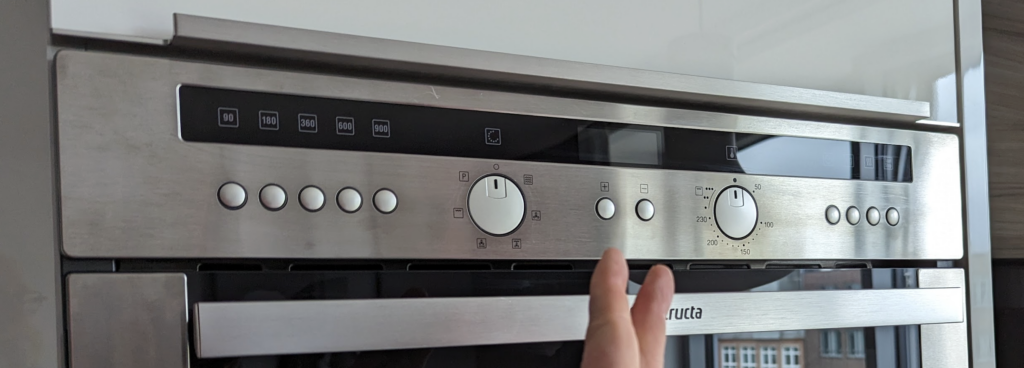
A microwave user interface that is intuitive – Not!
See image. See all the buttons. Find out what they do.
To the defence of the oven producer it is both a microwave and a regular oven; which makes it harder to create a simple UI.
But… why have plus to the left and minus to the right?
